Author Topic: Understanding Aerological Diagrams / Soundings  (Read 115428 times)

0 Members and 1 Guest are viewing this topic.

Offline Michael Bath

  • storm chaser
  • Administrator
  • Wedge tornado F5
  • *
  • Posts: 1,602
  • Gender: Male
    • Australian Severe Weather
Understanding Aerological Diagrams / Soundings
« on: 09 January 2009, 02:52:00 PM »
This thread has been started to help members read and understand aerological diagrams - or soundings - the atmospheric measurements taken by weather balloons. These provide a cross section of the temperature, dew point, wind speed and wind direction from the surface to the troposphere.

Some of this information will be pretty basic to many forum readers. To others it may be new. I encourage anyone to ask questions and also provide your own examples and answers. Use the image attach function as necessary.

Soundings are often included in the severe thunderstorm threads as they can provide a very clear picture of atmospheric conditions associated with the event. They are also extremely useful in non-alpine snow events too.

You can then try and identity similar features or patterns on other days to help with forecasting or nowcasting.

The diagrams are available here:
http://www.bom.gov.au/products/reg/IDS65024/
(enter bomw0007" for userid and "aviation" for password)

Archived soundings are available from this website:
http://soundings.bsch.au.com/index.html


The ground is at the bottom of the chart. Working your way up the left margin is the height in hectopascals (hPa). The equivalent height in km and feet is also shown slightly to the right of the hPa scale.

The temperature scale in degrees Celsius is marked with diagonal lines connecting equal values in the bottom, top and right hand side margins.

There are two red trace lines. The one on the right is temperature, the one on the left is the dew point. You can follow the diagonal temperature scale lines and where they cross the trace it is the temperature at that height (hPa). In this example above, the 500hPa temperature is about minus 12C.  The closer the left and right lines are together the moister the atmosphere is at that level, and of course the further apart they are the drier it is.

There are also two blue trace lines. These show you the values from the previous sounding for comparison.

The time the weather balloon was released is shown at the bottom of the diagram in red. The previous sounding time/date is in blue.

Along the right hand side of the diagram are wind speed and direction barbs. They point towards the way the wind is heading but are referred to by the direction the wind is coming from. In this example all the winds in the top half of the sounding are from the west. One line on the end of barb equals 10 knots, a half barb is 5 knows, and a solid triangle barb is 50 knots. You add all the barbs together to get the totals winds speed in knots. At 200hPa, the wind is a 100knot westerly (jetstream). At 700hPa there is a 20 knot SW wind.

You now have one chart that gives you a complete picture of the temperature, moisture, wind speed and direction.

Next we have to look at some of the other lines and variables marked, then how to work out good conditions for thunderstorms, snow, rain, heat or other weather.
Location: Mcleans Ridges, NSW Northern Rivers
Australian Severe Weather:   http://australiasevereweather.com/
Lightning Photography:   http://www.lightningphotography.com/
Early Warning Network: http://www.ewn.com.au
Contact: Michael Bath

Offline Dave Nelson

  • Elephant Trunk F2
  • *
  • Posts: 172
  • Gender: Male
    • Stormy Sydney
Re: Understanding Aerological Diagrams / Soundings
« Reply #1 on: 10 January 2009, 02:17:33 PM »
Thanks Michael for following up on my suggestion  :)

 Even the new bit of info like .... "The closer the left and right lines are together the moister the atmosphere
 is at that level, and of course the further apart they are the drier it is."  .....    added to my knowledge,  something I
never knew before

As time goes by and you add to this teaching session looking at identifying things like   Windshear, CAP's,
  how moisture at a particular level determines if you would get low or high based storm cells,  etc,  will be great

cheers
Dave N

Offline Harley Pearman

  • Barrel tornado F4
  • *
  • Posts: 584
Re: Understanding Aerological Diagrams / Soundings
« Reply #2 on: 10 January 2009, 02:31:47 PM »
Michael

Thank you. I am still learning how to use these. I have one question to ask. On many of these sounding charts, I see a grey line curving usually to the left. I do not understand what the grey curve means or what it is telling me. Can you please explain how the grey curve line function.

I see this grey curve on the standard NCEP Soundings or NOMAD soundings on the Stormcasts charts. Thank you.

Harley Pearman

Offline Jason(pato)

  • Elephant Trunk F2
  • *
  • Posts: 136
  • Gender: Male
Re: Understanding Aerological Diagrams / Soundings
« Reply #3 on: 10 January 2009, 05:27:22 PM »
Gday Harley,

That grey line you refer to is known as the Theoretical Air Parcel Plot line (TAPP). Its generally understood that the area between this grey line and the temp trace line indicates the amount of Convective Available Potential Energy (CAPE). So if there is a greater area between the TAPP and temp trace lines then the atmosphere is more unstable but a smaller or no area between those two lines would generally mean the atmosphere is more stable. There are many other variables that come into play though, and this area should not always be taken as gospel that storms are on the cards. Hope this helps, I'm still learning about all the little nuances that Aerological Diagrams (or Skew-T diagrams) throw up which either help or hinder a potential storm day. Looking forward to more input from our more experienced weather watchers, and feel free to add anything that might expand on my brief explanation.

Cheers Jason
South Lismore, Northern Rivers NSW.....Supercells are us!!

Offline Michael Bath

  • storm chaser
  • Administrator
  • Wedge tornado F5
  • *
  • Posts: 1,602
  • Gender: Male
    • Australian Severe Weather
Re: Understanding Aerological Diagrams / Soundings
« Reply #4 on: 12 January 2009, 09:54:42 AM »
All thunderstorms require low level moisture, instability and a trigger. Severe thunderstorms also require decent wind shear - speed and/or directional change of the winds with height.

The sounding immediately shows the moisture profile. The better thunderstorm setups will have plenty of moisture in the lowest few km of the atmosphere with dry air aloft. But not too much low level moisture - you want to see the temperature and dew point lines with a few degrees of separation like in the first diagram posted above. If there is too much moisture it will be cloudy and/or raining. The temp/DP lines will show very close together or the same values in those cases.

You can also see the complete wind shear profile at a glance. Wind speeds will typically increase the higher up you go. The better thunderstorm setups will have winds backing (anticlockwise) with height in the lower few km. For example N-NE at the surface, N at 925hPa, NW at 850hpa and W by 700hPa is a typical scenario along the east coast. This turning helps establish good updraft/downdraft separation and hopefully a supercell. Of course it is not that simple.

Instability has been touched on by some comments already. We are now going to look at working out instability on analysis soundings retrieved from the BSCH archives. The data for these is actually archived BoM data stored at the University of Wyoming (US). It is presented in much the same way as the BoM diagrams but also include some extra variables. The forecast soundings available from BSCH are drawn in the same way but are based on the GFS forecast of conditions, not the analysis of actual conditions.
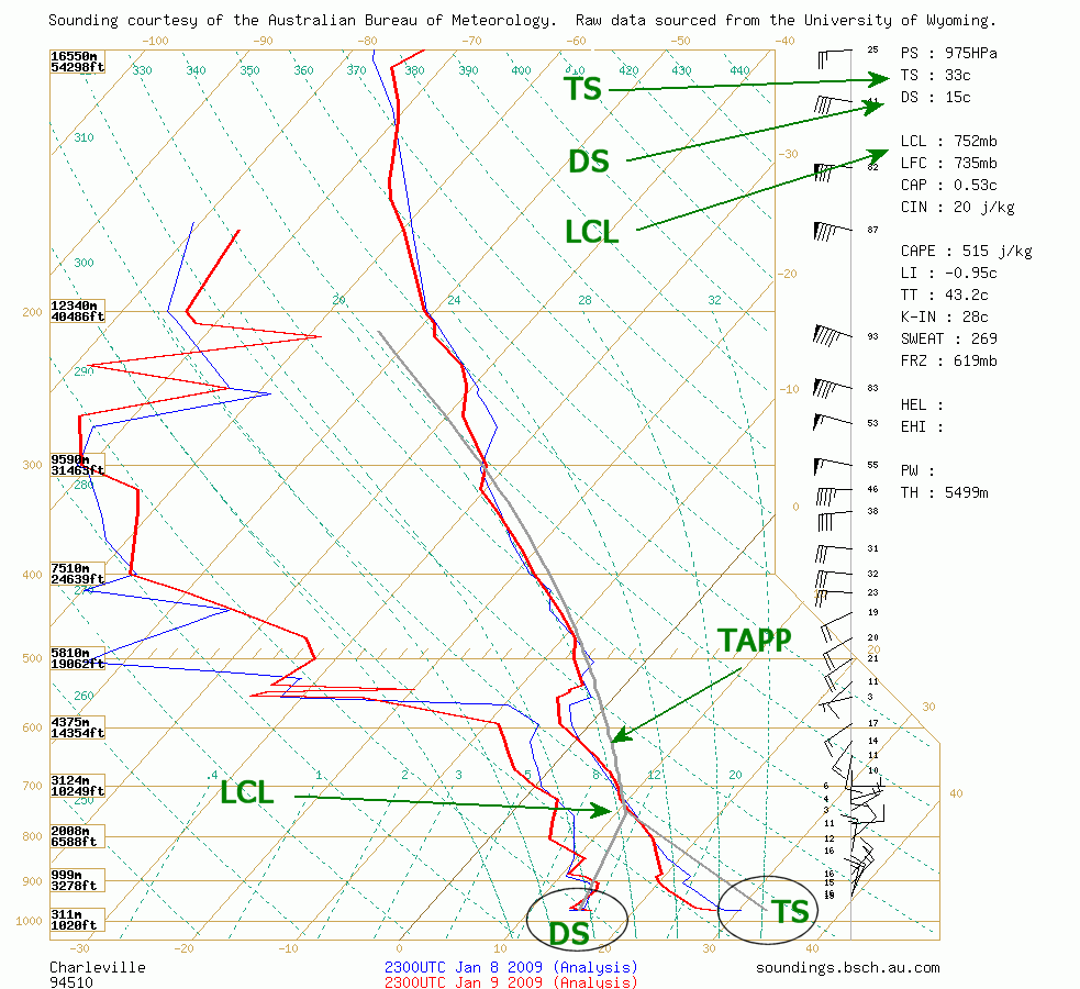


As mentioned by Jason, the Theoretical Air Parcel Plot (TAPP) is a representation of how a parcel of air may rise from near the surface. Where the grey line is to the right of the temperature trace it is unstable. You will see that the TAPP starts at the bottom of the diagram as an inverted "V". Those two lines meet at the Lifted Condensation Level (LCL) and the single line continues upwards following the alignment of the light green dashed curve (shown on the diagram from the surface to 200hPa). The left grey line is a forecast surface dew point (DS), the value of which is also shown amongst the variables on the top right of the diagram. The right grey line is a forecast surface temperature (TS). These two lines will follow the angles of the other two light green dashed lines.

The LCL will be where cloud bases will initially form - ie. the first cumulus clouds. As more and more convection occurs the air will mix - and cloud bases will develop lower down.

How do we know what the right values for DS and TS should be? There are a few calculations used with the BoM using one that differs from BSCH. With the BSCH website, you can also put in your own values. Eg. Look at observations from towns near the sounding location and enter in the actual temp and dew point.

Numerous thunderstorm indices can be determined from the calculations. The most common are Lifted Index (LI) and Convective Available Potential Energy (CAPE). The high the CAPE and lower the LI the better.
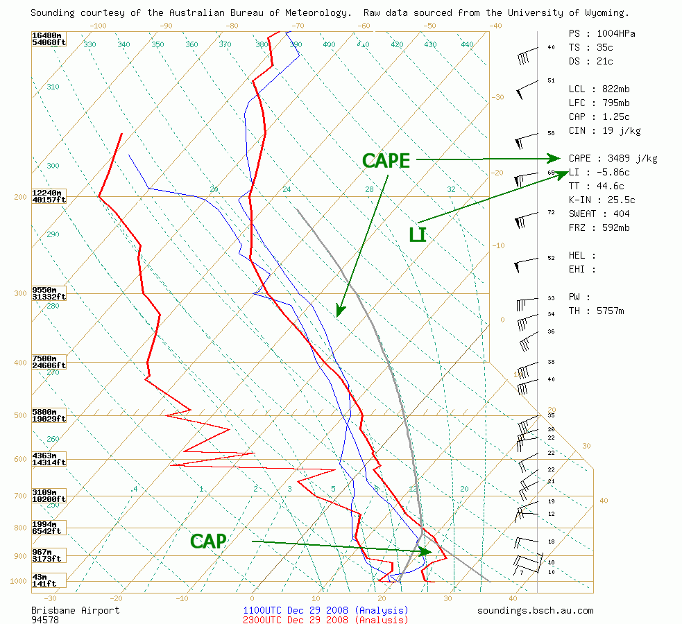


The CAP (or inversion) is a relatively warm layer of air that may delay or completely suppress the formation of thunderstorms. On the sounding it can be seen where the temperature stays the same or often increases with height. You will regularly see this showing above 900hPa. The first sounding posted in this thread has a CAP starting just below 900hPa. The 2nd sounding has none and the one just above this paragraph has quite a strong cap around 900hPa.

Inversions will also occur higher up - the most obvious one is at the tropopause where thunderstorm anvils occur. You may also see inversions in the mid levels. The 2nd sounding shown in this thread has an inversion at 550hPa. These do not necessarily stop thunderstorms but may slow updraft strength.


Lastly (for now), the trigger. This is one part of thunderstorm forecasting that you cannot see on a single sounding. Thunderstorm triggers can be from a surface trough or low pressure system, an upper trough or upper low, cold front, surface convergence, or just surface heating during the course of the afternoon.  None of these can be seen on the sounding, however you can use more than one sounding and compare upper level temperatures to help determine if an upper trough may be approaching.

Location: Mcleans Ridges, NSW Northern Rivers
Australian Severe Weather:   http://australiasevereweather.com/
Lightning Photography:   http://www.lightningphotography.com/
Early Warning Network: http://www.ewn.com.au
Contact: Michael Bath

Offline Dave Nelson

  • Elephant Trunk F2
  • *
  • Posts: 172
  • Gender: Male
    • Stormy Sydney
Re: Understanding Aerological Diagrams / Soundings
« Reply #5 on: 12 January 2009, 03:57:14 PM »
This great info Michael  :) 

  Quote..."As mentioned by Jason, the Theoretical Air Parcel Plot (TAPP) is a representation of how a parcel of air may rise from near the surface. Where the grey line is to the right of the temperature trace it is unstable. You will see that the TAPP starts at the bottom of the diagram as an inverted "V". Those two lines meet at the Lifted Condensation Level (LCL) and the single line continues upwards following the alignment of the light green dashed curve (shown on the diagram from the surface to 200hPa). " unquote

So presumably  the further to the right of the Temp trace the grey line is  the more instability there is ?
and if the grey line is to the left of the temp trace then things are relatively stable ?

in the 2nd sounding in the thread the grey line pretty much follows the temp line where in the 3rd sounding it arcs out far to the right of the sounding and doesnt even cross the temp trace  as in the 2 earlier soundings.

So I am concluding that you can determine an area of instability in the atmosphere between where the grey line crosses out from the temp trace at low levels and where it may cross back across the temp trace at a higher level ??

or if it doesnt cross back across the temp trace then the instability extends far up into the atmosphere ?

hope that query makes sense   ::)

cheers
Dave N

Offline Michael Bath

  • storm chaser
  • Administrator
  • Wedge tornado F5
  • *
  • Posts: 1,602
  • Gender: Male
    • Australian Severe Weather
Re: Understanding Aerological Diagrams / Soundings
« Reply #6 on: 13 January 2009, 04:25:05 AM »
Hi Dave - yes that's correct. Though you have to keep in mind that the position of the grey TAPP line is a forecast based on conditions at the time of the sounding. In reality the late afternoon period a few hours after the sounding was taken can be quite different in many setups. Eg. if the surface layer moisture increases or decreases more than expected. Increasing or decreasing the dew point makes a much bigger difference to overall instability than a changing surface temperature. The best way to see this in action is to load a sounding via BSCH then type in varying values for dew point and temperature (custom temp/DP from the dropdown list below the diagram) and click replot.

The third diagram in this thread is an extremely unstable environment (though I have entered a custom temp/DP). A temp of 35 and dew point of 21 was observed at Casino (NE NSW) at 3pm and it was just enough to break the CAP and provide CAPE of about 4000 - check the severe weather thread for 30th Dec 2008 to see what happened!

The 2nd diagram in this thread does not indicate a lot of instability but in reality it was probably a fair bit more as severe storms were occurring in that Charleville region of QLD during that afternoon.

Michael
Location: Mcleans Ridges, NSW Northern Rivers
Australian Severe Weather:   http://australiasevereweather.com/
Lightning Photography:   http://www.lightningphotography.com/
Early Warning Network: http://www.ewn.com.au
Contact: Michael Bath

Offline Dave Nelson

  • Elephant Trunk F2
  • *
  • Posts: 172
  • Gender: Male
    • Stormy Sydney
Re: Understanding Aerological Diagrams / Soundings
« Reply #7 on: 13 January 2009, 03:18:20 PM »
Michael,

   OK,  your last reply leads me to the next question .....  these soundings are carried out in a limited number of
places ( I dont have a list of where)  I assume the main metro centres and a few other places.

The question...   pick on a sounding for say... for Brisbane ....  what sort of area/region is that applicable for ?

  Can you use it over a 200km radius with some sort of reliability .... more ?  less ?    I appreciate  that they may
only give a rough indication and that you use soundings from other areas to get a pattern.   But heck Sydney is a
long way from Brisbane, conditions could be VERY different.  Where do I find a list of accessable sounding locations
for Oz ?  Are they closer together than Bris - Syd. ?

so many Q's    :D

Dave N

cloudfairy

  • Guest
Re: Understanding Aerological Diagrams / Soundings
« Reply #8 on: 14 January 2009, 06:27:07 AM »
soundings for Australia

try these :)

I think soundings are an indicator and as you said if you are in a place with no sounding station near by I don't think it makes sense to rely on one 200km away.

But what I do for Darwin (yep, we do have one) is, I have a look on the surrounding soundings. Storms usually don't form OVER Darwin. So Depending on the wind I have a look on Goves or Katherines Sounding, to get an impression if there may form storms, that could move towards me.

The size of area for which it is usable is depending on the topography, I would say and on the wind conditions.

Offline Michael Bath

  • storm chaser
  • Administrator
  • Wedge tornado F5
  • *
  • Posts: 1,602
  • Gender: Male
    • Australian Severe Weather
Re: Understanding Aerological Diagrams / Soundings
« Reply #9 on: 14 January 2009, 09:39:53 AM »
Dave - following on from Renate's post, you can use also use the direct link to the BoM soundings:

http://www.bom.gov.au/products/reg/IDS65024/
(enter bomw0007" for userid and "aviation" for password)

You'll see a map of all available sites. You often have to use one a couple of hundred ks away - eg. Wagga. For me, I use Brisbane and Moree all the time. You can use conditions above the surface layer to help determine what you'll get downstream a few hours later. It really depends on the weather pattern at the time. For a system progressing fairly quickly across the state using the Moree sounding may give a better idea of conditions later in the day than Brisbane will. Other setups will be fairly slow moving and using Brisbane gives a much better feel for things than Moree.

The surface or boundary layer can often be quite different between the sounding site and where you live, or nearby mountains, and working this out can be a key to picking areas for storms. For example, the dew points in the Northern Rivers are often a few or several degrees higher than what you'll have at Moree or Brisbane.

Another thing to look for on soundings is the lapse rate, or how quickly the temperature falls with height. The steeper the lapse rate the stronger updrafts will be. Take a look at the following two examples.

The first is taken at Darwin. There is a steady fall in temperature with height, in fact the example below (from this morning) is not too bad for Darwin, quite often you will see warmer temperatures throughout. Note also there does not appear to be a tropopause - storms in that region at this time of year are some of the tallest thunderstorms in the world and the tropopause is "off the chart". The winds are nearly always chaotic (compared to mid-latitudes) like in this example are a reason why organised storm cells such as supercells are rare.


This next example illustrates a steep lapse rate. The green dotted lines aligned from the bottom right of the chart towards the top left show you the maximum lapse rates possible. So from 950hPa to 480hPa is about as good as it gets. Very powerful updrafts and storms develop in this environment. Given also the awesome windshear, plenty of moisture in the lower levels and dry air aloft, supercells are the likely outcome. Is that a CAP at 940hPa? Convection (clouds) would start above that level (850ish) so there is no CAP and you would expect strong storms to fire early in this setup - which is what happened. The tropopause is around 200hPa.


Location: Mcleans Ridges, NSW Northern Rivers
Australian Severe Weather:   http://australiasevereweather.com/
Lightning Photography:   http://www.lightningphotography.com/
Early Warning Network: http://www.ewn.com.au
Contact: Michael Bath

Offline Shaun Galman

  • Stove pipe F3
  • *
  • Posts: 441
  • Gender: Male
    • ridgelightning.com
Re: Understanding Aerological Diagrams / Soundings
« Reply #10 on: 14 January 2009, 12:14:53 PM »
Thanks for starting this thread idea Dave N. I too have had a few head-scratching times looking at soundings lol.

MB: Thanks for explaining it so well too! It's very easy to grasp and follow and I will definitely put it to the test asap! I usually have a quick glance at the CAPE and LI numbers then make a decision from those but now you have showed us what the lines ie; temperature/dew point traces are and how they actually work it will help tremendously!

It's hard sometimes to correlate between soundings when they are so far away from a particular area (such as us out here) when we can be receiving severe weather from the West and at the same time the Moree sounding is looking rather stale and unimpressive? I'm now looking forward to comparing the Cobar and Moree soundings the next time we have storm development taking place!

I think this thread will become very popular!
Kindest regards,
Shauno 
Chasing Region: Lightning Ridge. N.S.W.
Website: www.ridgelightning.com

Offline David C

  • Global Moderator
  • Barrel tornado F4
  • *
  • Posts: 643
  • Gender: Male
    • Thunderbolt Tours Storm Chasing Adventures
Re: Understanding Aerological Diagrams / Soundings
« Reply #11 on: 14 January 2009, 01:12:24 PM »
I have one question to ask. On many of these sounding charts, I see a grey line curving usually to the left. I do not understand what the grey curve means or what it is telling me. Can you please explain how the grey curve line function.

I see this grey curve on the standard NCEP Soundings or NOMAD soundings on the Stormcasts charts. Thank you.

Harley Pearman
Gday Harley,

That grey line you refer to is known as the Theoretical Air Parcel Plot line (TAPP).

You are probably referring to the TAPP as Jason suggested above, Harley.  You might also be talking about the Adiabats, and since Michael introduced the concept of lapse rates above, it is probably timely to locate the adiabats on the above skew-ts. (Cue for someone to do the photoshop!).
I think are grey in some cases hence my reply to Harley -- on the BoM soundings they are the two sets of curved, teal green of whatever they are (can damn well barely see them on this 11 inch monitor!), dashed lines in increments of 10Kelvin (hence large values on the x and y axes). 

Dry adiabats are lines of constant potential temperature. (From wikipedia - "The potential temperature of a parcel of air at pressure P is the temperature that the parcel would acquire if adiabatically brought to a standard reference pressure P0, usually 1000 millibars). In otherwords, the dry adiabats show the rate of change in temperature with height of a parcel of dry air. The slope of dry adiabats is 9.8°C -- the dry adiabatic lapse rate.

Moist adiabats on a skew-t represent lines of constant equivalent potential temperature (theta-e). (many chasers who chase the US know that there we have available and often use theta-e as an indicator of convective energy in the pre-storm environment, since it is easily computed from surface data and reflects both the temperature and moisture content and therefore theta-e ridges demarcate regions where surface instability is at a maximum).

From wikipedia - "The equivalent potential temperature is the temperature a parcel of air would reach if all the water vapor in the parcel were to condense, releasing its latent heat, and the parcel was brought adiabatically to a pressure of 1000 millibars.

In otherwords, moist adiabats show the rate of change in temperature with height of a parcel of saturated air. The slope of the moist adiabats does vary since the moist adiabatic lapse rate is not constant. eg. From one of the skew-ts above, you will note that the moist adiabats have smaller slopes than dry adiabats because rising, saturated air cools more slowly than dry air (as the water vapor condenses the latent energy absorbed during evaporation is released). When lifting warm and humid air since more latent heat is released but as the parcel ascends, less condensation and therefore less latent heat release occurs -- near the top of the plot at the lowest pressures and temperatures, the slope of the moist adiabats is more or less the same as the dry adiabats.

Storm Chaser,
Thunderbolt Tours - USA & Australia Storm Chase Tours
www.thunderbolttours.com

Offline Harley Pearman

  • Barrel tornado F4
  • *
  • Posts: 584
Re: Understanding Aerological Diagrams / Soundings
« Reply #12 on: 14 January 2009, 02:33:13 PM »
David, Jason and Michael, thank you for explaining this and of course this thread. This thread will come in useful as I have started using these when I go out. Even though I had limited grasp of how to use it properly, I have realized that I have done 4 storm chases this season using the charts and have managed to score storms of varying degree of intensity on all four occasions.

Jason, thanks for explaining the TAPP line to me as I had no idea what that was until your explanation.

Harley Pearman

Offline Dave Nelson

  • Elephant Trunk F2
  • *
  • Posts: 172
  • Gender: Male
    • Stormy Sydney
Re: Understanding Aerological Diagrams / Soundings
« Reply #13 on: 14 January 2009, 03:41:26 PM »
Thanks Michael
                    and to the input of the others as well   :)

  Some of the best teaching I have seen on the forum for ages !!!

ok  here's my next question ....

  I have noticed that in all the above soundings that the DP trace goes into wild variations in the ~ 600 - 400hPa
area.  This seems to happen to varying extents regardless of levels of stability/ instability indicated to the right
side of the sounding....

  What is happening in that region of the atmosphere that is always causing the DP to vary so wildly ?

EDIT

Additional Q I have been meaning to ask...  where does the name Skew-T come from ?

cheers
Dave N
« Last Edit: 14 January 2009, 03:48:52 PM by Dave Nelson »

cloudfairy

  • Guest
Re: Understanding Aerological Diagrams / Soundings
« Reply #14 on: 15 January 2009, 05:18:26 AM »
The dewpoint temp isn't always varying like that. Look at this one for example.


The Dewpoint temp is an indicator for how dry or moist the air is. So, if the slope is not steady you can see the different air layers.
The air isn't mixing as if you would stir it permanently.

Well, maybe I should leave it to Michael. I don't find the right words.

Renate
« Last Edit: 15 January 2009, 07:37:37 AM by Michael Bath »